-
Users Handbook
-
-
-
- Intro & Basics
- All Objects have Descriptions
- Check for unused procedures
- Compiled Procedures up to date
- Invalid Source Layers
- Required Columns
- Check for abnormally ended Jobs
- Check for blocked Jobs
- Check for disabled Tasks
- Check for duplicate tasks in different Jobs
- Check for duplicate tasks in same Job
-
-
-
Administrators Handbook
-
- Register URL
- Configure SSL/HTTPS
- Configure Proxy-Server
- How to edit the appsettings.json file
- System Settings
- Global Parameters
- Allow Service Account to Logon as a Service
- LDAP & SSO Authentication
- Migrating Testcases and Configuration
- Licenses Management
- Manual Configuration
- Exposing the BiG EVAL REST API to other Network Segments
-
Developers Handbook
-
Known Problems
-
Demo Virtual Machine
-
Release Notes
-
General
User Interface
- Home
- Users Handbook
- First Steps
- User Interface
The User Interface of BiG EVAL consists of the following elements.
Main Menu
On the left side of the user interface is the main menu or navigation area. Use it to reach the features of BiG EVAL.

Header Bar
On the top border there is the header line. It contains the message center and the help-menu.

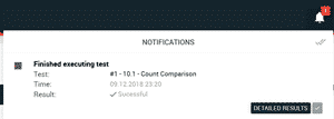
Messagecenter
The messagecenter shows important notifications (e.g. testresults). Some messages offer you functions like direct access to the testresults and details.
Use the checkmarks to commit and hide the messages.

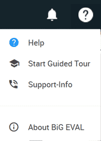
Help-Menü
Use the question mark menu on the top right to navigate directly to the support portal.

Search
Some screens offer search functionallity. This is indicated by the magnifier icon on the right side of the header bar right besides the messagecenter.

Click on the magnifier icon to open the searchbox. Enter your search query to immediately show the search results.

